MOBILE APP DEVELOPMENT / ROCKET REMIT

Enhancing User Experience for Rocket Remit Money Transfer App

Rocket Remit had the reach — transfers to 50 countries — but everyday users struggled with registration, unclear rates, and too many steps. EB Pearls focused on fixing the moments where users stopped.

Meet Rocket Remit

Rocket Remit operates in a space where small delays have real consequences. 

A transfer isn’t just a transaction. It might be school fees due tomorrow, rent that can’t wait, or support sent across borders late at night. Every extra step adds friction to something that should feel immediate.

The app allowed users in Australia to send remittances to more than 50 countries. The infrastructure existed, but the experience didn’t match the urgency of the use case.

People arrived ready to send. Something along the way made them pause.


The product worked. The problem was how people moved through it.

The issue for Rocket Remit wasn’t whether users needed the service. They did. The issue was whether the product helped them act on that need without friction.

icons8-user-groups-1-1-2

Momentum Broke Early

Users began registration but slowed down within the first few steps. On mobile, even small delays caused people to abandon the process entirely.


icon-announcement-02

Commitment Came Too Soon

Before users could explore or understand the product, they were asked to sign up. Many weren’t ready to commit without first seeing how it worked.
icons-agile-coach

Uncertainty at the Critical Moment

Exchange rates only appeared later in the flow. Users hesitated when they couldn’t immediately see what their money would become.
icons-collaboration-female-male

Everyone Was Treated the Same

A first-time visitor, a returning user, and someone halfway through setup all saw the same journey. The experience didn’t adjust to where they were.

I just wanted to know what I’d get before I committed.

Users paused at the exact moment they needed confidence. Transfers were started, then left unfinished. Accounts were created but never completed. Intent was high, but follow-through was fragile.

They almost didn't go ahead

Changing this flow meant rethinking decisions that had been in place from the beginning.

  • If we move things around, do we risk breaking compliance?
  • What if giving access early reduces sign-ups?
  • Are we making it too easy before users are verified?

The real risk wasn’t letting users explore earlier. The real risk was asking them to commit before they felt ready.

10-2

Three moments that built trust

Progress came from shared clarity, not just execution.

The design started with where users actually stopped

Before redesigning a single screen, the EB Pearls team watched real users move through the existing Rocket Remit app. Where they paused. Where they re-read a screen. Where they closed the app and didn't come back.


Everyone had assumed the problem was speed, that the registration flow needed fewer steps, the screens needed to load faster, the friction needed to go away. What the team found was something different.

★   the reframe   •   built to last™ right design
Confidence didn’t come from fewer steps.
It came from seeing value earlier.

Built around the customer, not the software

The team restructured the mobile experience using Flutter, while maintaining stability across NodeJS services, GraphQL APIs, and AWS Lambda infrastructure.

icons8-choice

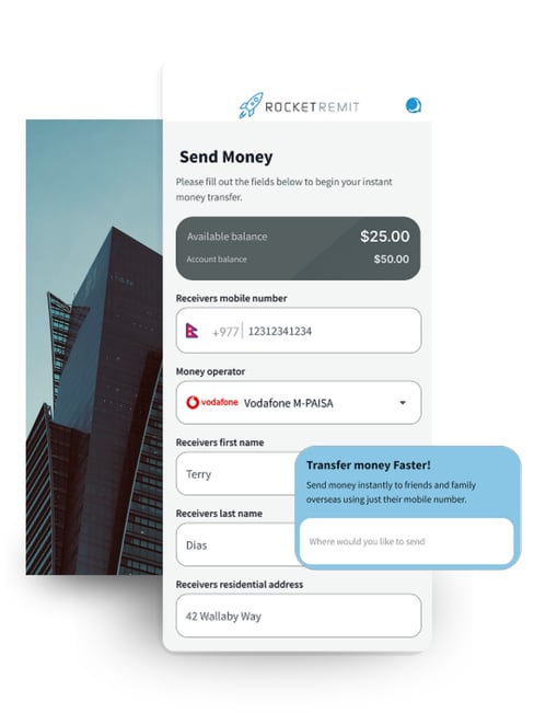
Streamlined Registration Flow

Onboarding was broken into smaller steps, allowing users to progress without feeling blocked.
icons-graphql-api-1

Guest User Access

Users could explore key features before signing up, reducing the pressure to commit early.
icons8-performance-macbook

Real-Time Exchange Rate Calculator

Rates were surfaced at the beginning, helping users understand outcomes before taking action.
icons-trello

Multi-State User Handling

The system adapted based on whether a user was new, returning, or mid-setup.
partnership opportunities

Responsive Interface System

Layouts adjusted across screen sizes, ensuring consistency on different mobile devices.
icons-salesforce

Expanded Loading Options & Channels

More ways to fund and send money gave users flexibility at the final step.

Making Money Move Without Friction

01 Simplifying a complex transfer flow Sending money involves multiple steps — verification, currency conversion, payment methods. The challenge was making this feel simple without removing critical steps.

02 Building trust in every transaction Users needed to see exactly what they were sending and receiving. Any confusion around fees or exchange rates created hesitation.

03 Speeding up onboarding without risking security Identity checks are required, but long verification steps slow users down and increase drop-off during signup.

04 Designing for users with different levels of digital confidence Some users send money regularly. Others do it rarely. The platform needed to work for both without adding complexity.

The before and after, in numbers

Rocket Remit moved from a complex, high-friction money transfer experience to a fast, transparent, and intuitive platform. The result wasn’t just better UX—it was stronger trust, higher usage, and a more efficient operation built for global scale.
Metric Before After  ·  EB Pearls
User Onboarding Speed Slow, friction-heavy registration process
35% faster
Operational Cost High maintenance and manual backend effort
40% reduction
User Engagement Low engagement due to complex journeys
45% increase

Hesitation stopped being the default. Confidence became the path forward.

Before

“I just wanted to know what I’d get before I committed.”

After

“Now I can check, decide, and send in one go.”

The experience began to feel different in the first few seconds. Users explored instead of hesitating. They saw outcomes before making decisions. The flow no longer asked for trust upfront — it earned it step by step.

Partial users didn’t stay stuck halfway. They moved forward when they were ready. Transfers didn’t stall at uncertainty points. They continued with clarity.

9-2

Ready to Transform Your App’s User Experience?

Don’t let your app fall behind—take the first step toward revolutionising your user experience today.

1 Your Information
2 Book Meeting
3 Confirmation

Tell us about your app. We'll take it from there.

Share a few details about your project and what you need help with. Once you submit the form, you’ll be able to book your free discovery call.
Contact EB Pearls
What to expect on your call

What to expect

  1. 1

    Share a few details

    Complete the form with your contact details and what you need help with.

  2. 2

    Book your free discovery call

    Once you submit the form, choose a time that suits you for your discovery call.

  3. 3

    Privacy comes first

    Sign an optional NDA to ensure the highest privacy level and protection of your idea.

  4. 4

    Discovery call

    We’ll discuss your goals, the support you need and answer your questions. If we’re a good fit, we’ll outline the next steps.