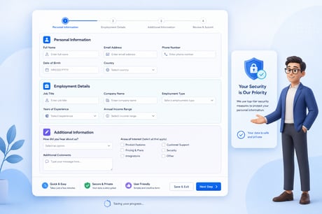
Every online application has a moment where people want to give up. It might be the fourth screen of a form, a request for a document they don't have on hand, or a loading spinner that runs a few seconds too long. You can’t see it happening, but you feel it in your conversion rates.
In 2026, users have little patience for clunky journeys. They're used to ordering dinner in three taps and transferring money in seconds, so they bring those expectations to every application you ask them to complete. Here's a practical playbook for reducing friction in your product, whether you're building a banking app, a booking platform or a customer portal.
Why friction costs more than you think
Friction isn't just an annoyance; it's a roadblock. Every unnecessary field, confusing label or repeated request chips away at the number of people who finish what they started.
As an example, take car finance. Australians searching for fast car loans with a simple process aren't only after a competitive rate. They want to know the experience won't eat up their weekend. When a form feels long or unclear, people don't push through. They open another tab and hope your competitor did it better. The same logic applies to any product that asks users to apply, register or submit information.
Step one: map the journey before you redesign it
Before you touch a single button, walk through your application as a first-time user. Note every point where someone has to stop, think, search for information, or make a decision they weren't expecting.
A simple friction audit works well here:
- Count the screens and fields between the first tap and the final confirmation.
- Identify every point where users need to leave the app to find something, like a licence number or an ABN.
- Watch five real people attempt the flow, and see their process.
- Check where analytics show the biggest drop-offs.
This is the same discovery thinking we use in our fintech app development work, where complex financial processes need to feel intuitive for everyday users. Mapping the problem properly means you fix what's actually broken, not just what you assume is.
Step two: ask for less, and ask later
The fastest way to reduce friction is to remove the trouble entirely. For each field, ask yourself whether you genuinely need this information right now, or whether you're collecting it because the old paper form did.
Some practical moves:
- Defer non-essential information. You can often collect secondary details after the user has committed or been approved.
- Use what you already know. If you can pre-fill details from a previous session, a device setting or a trusted verification service, don't make people type them again.
- Make optional fields clearly optional. Or cut them altogether.
- Break long forms into short, focused steps. A progress indicator tells people how close they are to finishing and sets a goal.
Step three: design the form like a conversation
The best applications have flow, like a person guiding you through. A few additions make the difference:
Write plain language labels. Skip internal jargon. If you wouldn't say it out loud to a customer, don't put it on screen.
Validate in real time. Nobody likes submitting a form only to be told three fields were wrong. Show friendly, specific error messages as people go, and tell them how to fix the problem.
Get the keyboard right. Numeric keypads for phone numbers, email keyboards for email addresses and autofill support save precious seconds. For mobile users, these details can make or break completion rates.
Design for thumbs. Large tap targets, sensible spacing and primary actions within easy reach keep people moving without frustration.
Step four: build trust at the moment of doubt
Friction isn't just about effort; it's also about hesitation. When you ask for sensitive information like income details, identification or bank connections, users pause and wonder whether it's safe and whether it's necessary.
You can ease that doubt by explaining why you're asking, right where you ask. Show clear privacy and security cues, and be upfront about what happens next and how long it will take. In finance especially, a calm, transparent interface works just as well to convert as a fast one.
Step five: make speed visible
A fast process that feels slow is still a slow process. Users judge speed by what they can see, so use design to communicate progress:
- Use skeleton screens and subtle animations instead of blank loading states.
- Confirm each completed step so people feel momentum.
- Set clear expectations, such as "this usually takes about two minutes", and then meet them.
- Send instant confirmation once the application is submitted, with a plain explanation of what comes next.
Slow API calls, bloated pages and unreliable verification steps all show up as friction on the front end. Good product design and solid engineering have to work hand in hand.
Step six: test, measure and keep improving
Reducing friction isn't a one-off project. Habits change, devices update, and what felt smooth last year feels dated now. Build a plan for continuous improvement:
- Track completion rate, time to complete and drop-off by step.
- Run small A/B tests on one change at a time
- Gather qualitative feedback through short in-app prompts or follow-up interviews.
- Review the numbers regularly and prioritise the fixes with the biggest impact.
If you're new to this process, our mobile app learning hub covers everything from planning and budgeting through to monitoring and optimisation, so you can see where analytics-driven improvement fits into the bigger picture.
Accessibility is necessary
One more thing worth saying plainly: if your application isn't accessible, it's creating friction for some of your users all of the time. Sufficient colour contrast, clear focus states, screen reader support and generous text sizing make the product easier for everyone, including people using your app one-handed on a crowded train or in bright sunlight.
Putting the playbook to work
If you only take three things from this playbook, make them these:
- Remove or defer anything that isn't essential to completing the application.
- Write and design like a human, with plain language, helpful errors and visible progress.
- Treat friction as a measurable problem and keep testing until the numbers move.
Whether you're launching something new or refining an existing product, small changes to your application flow can lift conversions in a big way. For more practical guidance on building products people actually enjoy using, explore the rest of our product and app development insights, and when you're ready to talk through your own application journey, the EB Pearls team is here to help.