

22 Sept 2026
Author
Yangjee Rai Shrestha


Your support provider meets every SLA, and you still couldn't say whether the system is in better shape than it was last year. That's an awkward gap when your sponsor asks. Here's how to close it: four measures, what good looks like for each, and four steps you can start before your next monthly review.

Why we wrote this
It matters more as teams release more often, because each release is another chance for an old fault to return. We wrote this for whoever owns a live system and reviews its support provider, whether that's us or someone else. If your system is small and rarely changes, tickets closed may be all you need, and we say so below.
The report that looks fine
It's the monthly support review. The report opens on a green number: 140 tickets closed, every response inside the agreed time. Everyone nods.
Then you scroll down. The month-end reconciliation job failed again, and the partner integration timed out twice more.
Why a busy support team can hide a declining system
The usual answer is volume and speed: tickets closed, first response time, SLAs met. Most application support KPIs stop there. They're worth having, but they describe the support team's effort, not the system's health.
The concession: measuring improvement takes real effort. Root causes have to be tagged by hand at first. Your numbers will probably look worse before they look better, because you'll start seeing what was always there.
Four measures that show whether support is working
These are the software support metrics we'd put on any live system that changes often. Two come from DORA, the long-running research programme on software delivery performance. The other two are the ones your users and your finance team feel first.
1. Repeat incidents
The share of incidents caused by something that has already caused an incident before. It's the clearest single sign of whether problems are being fixed or just closed.
-
What it looks like: the same integration, job or screen appearing in the ticket list month after month, often under different titles.
-
What good looks like: the repeat share falls each quarter, and every repeat cause has a named fix with an owner and a date.
2. Time to recover
How long from the moment something breaks to the moment users are working normally again. It's often reported as mean time to recover (MTTR). DORA has since moved to failed deployment recovery time: "the time it takes to recover from a deployment that fails and requires immediate intervention."
-
What it looks like: a clock that starts at the first alert or customer report, not when someone picks up the ticket, and stops at service restored, not ticket closed.
-
What good looks like: you track the median and the worst case, and both trend down. The worst case matters more, because that's the one your sponsor hears about.
3. Change failure rate
The share of releases that need urgent fixing once they're live. DORA defines change fail rate as "the ratio of deployments that require immediate intervention following a deployment", usually a rollback or a hotfix.
-
What it looks like: a release goes out Thursday, something breaks Friday, and the weekend goes on patching it.
-
What good looks like: the rate holds steady or falls while you keep releasing at the same pace. If it only drops because releases slowed down, that isn't improvement.
4. Cost to run
What it takes each month to keep the system working: support hours plus hosting, and the share of hours spent on manual, repeated work. Google's SRE book calls that work toil: manual, repetitive, automatable, and it "scales linearly as a service grows."
-
What it looks like: someone reruns a failed job by hand every morning, or the cloud bill climbs faster than your user numbers.
-
What good looks like: cost per user or per transaction is flat or falling as usage grows, and the manual share of support hours shrinks.
How to start measuring in four steps
You need an export, a spreadsheet and one person who owns the tagging.
Step 1: Pull the last 90 days of tickets
Export every incident and support ticket from the last 90 days. Add your release log and the last three months of hosting bills. Ninety days is enough to show patterns without becoming a project of its own.
Step 2: Tag each ticket by root cause
Tag by cause, not symptom, and mark any ticket whose cause has appeared before. Keep the list to six to ten categories. Integration failure, data issue, configuration, release defect, infrastructure and user how-to cover most systems.
Google's postmortem guidance sets the goal as preventive actions that "reduce the likelihood and/or impact of recurrence." Tagging shows you which causes deserve that work.
Step 3: Set your baseline
Work out the four numbers from those 90 days and write them down with the date. Don't set targets yet. The first job is an honest starting point.
Step 4: Review monthly
Spend 30 minutes each month on the same four numbers, plus the top three repeat causes and who is fixing each. Judge the trend each quarter, not the single month. One bad release can swing a month on its own.
If an outside provider runs your support, ask them to bring these four numbers to the next review. How they respond will tell you a lot.
What the numbers looked like for EML
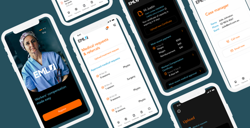
EML's result was 65% faster resolution and 40% lower manual cost. Map those against the four measures and they land on two directly.
The useful pattern for your own review: repeat incidents and change failure rate are leading measures. Time to recover and cost to run lag, so expect them to move a quarter or two after the first two.
What drives the effort
Getting these measures in place isn't free, and the effort depends mostly on the system you have:

System age

Number of integrations

Documentation

Existing monitoring
How we approach it

NEXUS Sustain
Each quarter, we set out what the numbers point to. It names the repeat causes worth fixing at the root and the improvements worth building next. Sustain itself doesn't cover new features, so the brief gives you a clear case to take to whoever builds them, us or anyone else.
Check your own problem
If you'd like a second view on what your support numbers are telling you, book a call. You'll leave with the two or three things worth fixing first.
Frequently Asked Questions

As a QA Manager, Yangjee is passionate about quality, automation, and security testing. She thrives on continuous learning to deliver exceptional software.
Read more Articles by this Author