 Back
Back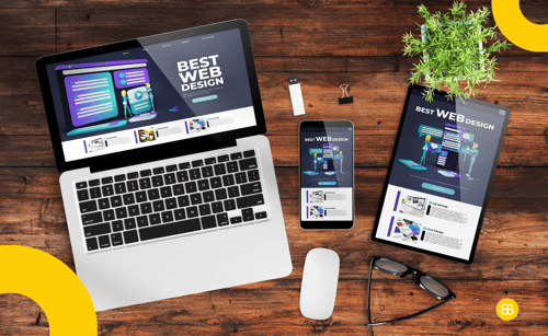
Responsive Design is a design approach that ensures your app or website automatically adjusts to different screen sizes and devices, like phones, tablets, or desktops, without losing functionality or visual appeal.
Why It Matters
- Helps deliver a consistent user experience across all devices
- Improves retention by reducing friction on mobile and tablet views
- Enhances SEO performance and mobile discoverability
- Reduces development overhead by avoiding separate designs for each platform
Use This Term When...
- You're reviewing UI mockups or wireframes for mobile and desktop
- You're building a web app or marketing site that must work on all devices
- You're testing layout issues on tablets, phones, or large screens
- You're discussing front-end frameworks or CSS strategies with developers
Real-World Example
In one of our projects, we implemented responsive design to ensure the app looked and functioned seamlessly across mobile, tablet, and desktop devices. This provided a consistent user experience and expanded accessibility without building separate interfaces.
Founder Insight
Founders often overlook responsiveness until users complain. Testing designs across screen sizes from the beginning saves time, money, and reputation down the line.
Key Metrics / Concepts
- Viewport Width – The visible width of a user’s screen that the layout must adapt to
- Breakpoints – Screen width thresholds where layout changes are triggered
- Bounce Rate – High bounce on mobile can indicate poor responsiveness
Tools & Technologies
- Figma / Adobe XD – Used to preview how UI behaves on multiple devices
- Chrome DevTools – Simulates different screen sizes for testing responsiveness
- Bootstrap / Tailwind CSS – Frontend frameworks that simplify responsive layout creation
What’s Next / Future Trends
As foldable screens and wearable devices grow in popularity, responsive design is evolving to handle even more diverse screen formats. Expect more emphasis on fluid layouts, accessibility, and performance-first mobile design.
Related Terms
UI Design – Focuses on the visual elements and their interactions
Cross-Platform App – Apps designed to work across multiple operating systems
Device Type – Refers to the category of device: mobile, tablet, or desktop
Mobile-First Design – Designing primarily for small screens and scaling up
Frontend Development – The coding part of implementing responsive design
Helpful Videos / Articles / Pages
Blog: Why make your website responsive?
Call to Action
Unsure if your app or site feels right on every screen? Let’s review your design together and make it responsive-ready.