Table of Contents
Last year brought some huge changes to the App Store. With shorter title limits and Search Ads, the App Store is nearly unrecognizable compared to early 2016. This year, don’t get swept up in the changes. Instead, take these steps to be proactive with your app.
5. Optimize Your App Listing
One of the most important things you can do for your app is to optimize its title, keywords, and description (and on Google Play, your short description). Optimizing your app listing will help it rank for important search terms that your users may be looking for, placing your app in front of more eyes.

The process of optimizing your app differs between Apple and Google Play. On Apple, the optimization process starts at your title and keyword bank. These are the perfect spots to place relevant search terms that you wish to rank for.
From there, you build relevance for those terms in your description and screenshots. Explain or show to users (and to any Apple employees who may review your app listing) why your app deserves to rank for the terms you’ve outlined.
Optimizing for Google Play differs because there is no dedicated keyword bank. Instead, Google crawls your app description to seek out terms that may be relevant to your app. Because Google’s algorithm weighs words at the front of sentences more heavily, try structuring your app’s features in a list, with related terms grouped together.
With your app listing optimized, you will have a great foundation for the rest of the year.
4. Optimize Creative for Conversion
Now that your app listing has been optimized, it’s time to do the same with your creative assets. Often overlooked, creativity is actually one of the most important aspects of the app listing when it comes to App Store Optimization.
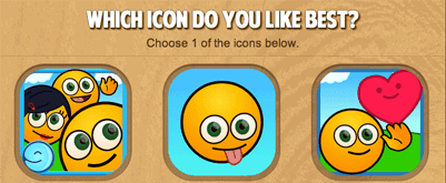
Your app’s creative consists of its screenshots and its icon. Both of these must be optimized to quickly and easily show users what your app is about.
Begin with your app’s icon. Think of your icon as a sort of logo for your app. The icon should quickly summarize to users the general functionality of your app and should be immediately recognizable as it will be one of the first things users see in search results. Like a good logo, your icon shouldn’t be too complex or contain too many different color schemes. Also, keep in mind that users will look at your icon on their Home screen, so your visuals should stand out from other apps in the store.
Your screenshots, on the other hand, are more like advertising posters for your app. The first two screenshots will be visible to users in App Store search results, so they hold the heaviest burden.

Your first two screenshots should always call out the core features of your app and make it clear to users how your app will work. With 65% of app downloads originating from search, many users won’t even see your other screenshots before making their decision.
Crafting your creative is essential for optimization because it serves as the primary driver of conversion and branding. Your creativity helps users (and Apple) understand why your app is relevant for your requested search terms and makes your app recognizable and appealing to search.
After all, it doesn’t matter how many users you drive to your app if the listing itself isn’t appealing.
3. Take Out Search Ads
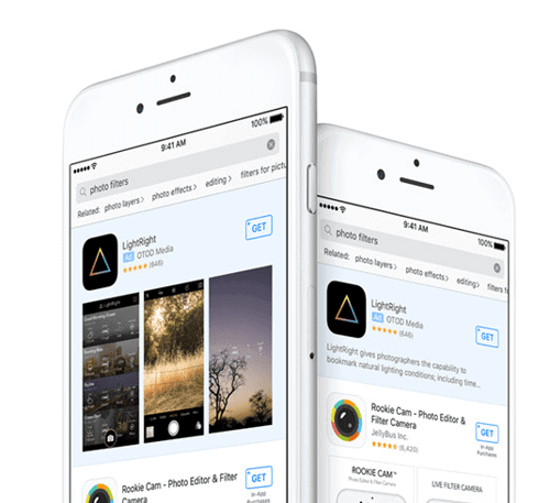
Search Ads have provided a new way for developers to propel their apps to the top of search results. Like many search advertising platforms, Apple’s Search Ads are keyword-based. That means you can target specific keywords, and appear at the top of search results for those words.
It is important that your app listing and creative already be optimized when you take out your Search Ad. When determining whether or not to place your app for a Search Ad, Apple leans heavily upon relevance. This relevance is largely established through your app’s description.
Your icon and screenshots are also incredibly important in your Search Ad. While ads come in multiple configurations, certain Search Ads can have up to three screenshots included.

With your creative already optimized, you can let your screenshots do the talking in the ad. Similarly, your icon remains one of the first elements of your app that users will see. Again, placing your app listing in front of thousands of users won’t help unless the icon and screenshots are appealing.
2. Track Market Trends
Both the App Store and Google Play are constantly changing. Popular search terms fluctuate as new apps come out and new events occur around the world. Certain times are best for certain app types. For example, Valentine’s Day is a great time for dating apps, and the holiday season is perfect for shopping apps.
As you see new trends emerging on mobile, update your app’s keywords, description and screenshots to reflect those trends.
1. Update Often
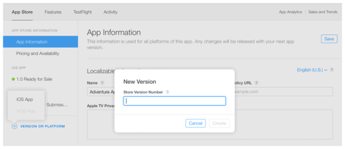
Both users and the app stores themselves like to see developers update their apps. It’s a great opportunity to show everyone that your app is still vibrant, alive and updating. It also represents a good chance to keep up with trends and adapt your app to emerging market strategies.

This has been a guest blog post by Dave Bell from Gummicube.

Tiffany brings creativity, adapts quickly to new tools, and leads atomic design principles to enhance UI/UX efficiency.
Read more Articles by this Author
