We develop user centric website, mobile apps and IOT that grows your business.
Global Leader in Software Design and Development, working with 1400+ businesses across Australia and beyond!


.png?width=150&height=150&name=ACM-300x127%20(1).png)


.png?width=150&height=150&name=ACM-300x127%20(1).png)


We’re a team of innovators
EB Pearls is a full-service software development agency. We help you connect with your customers and grow your business with creative, results-driven websites and mobile applications.
360+
Developers440+
Mobile Application Completed4
Offices4200+
Websites Completed72+
International Awards2004
Australian owned and operated since 2004#1
Ranked no. 1 with 4.9 star in Clutch20+
Years in operationOur Services
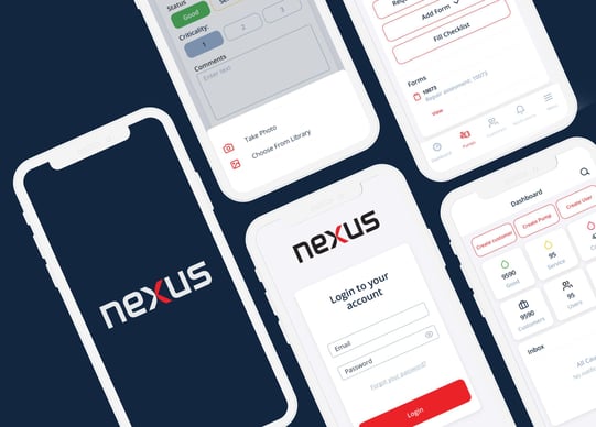
Nexus Audit App to Improve Pump Auditing
By harnessing the power of mobile apps, All Pumps in collaboration with EB Pearls aimed to streamline their installation and maintenance services, boost efficiency, and enhance the overall customer experience.
Logistics
View Project
Revolutionising Internships For NSW Students
Explore how we successfully managed to convert a paper-based system to a digital platform, streamlining processes for students, teachers, and government analysis.
Continue reading to learn all about the key features of our mobile app that made internship reporting seamless and effective for students and teachers across NSW.
Education, Government
View Project
Unleashing the Power of Mobile Apps For Rural Press
Corporate, Agriculture, Media, Telecommunications
View Project


Why chose EB Pearls for your mobile app development company?
Industry Leader
Team
Our wonderful team of experts across four cities work as one to exceed all your expectations for high-quality projects delivered on time & budget. They’re the secret sauce that makes working with EB Pearls a great experience.
Agile Process
We’ve got solid, proven processes to handle projects of any size and complexity. Our infrastructure allows us to scale resources up or down to give you the best quality and most affordable outcomes.
Always in-house
We don’t outsource. We source, hire, train and payroll all our talented employees, so you know the people working on your project are of the highest calibre and completely trustworthy.
Proven results
As Australia’s Top-Rated Sydney App Agency, we’ve got the experience, expert team, and ‘App Store Top 10′ track record to turn your idea into an innovative, popular app. We’ve also got a 4.9-star rating from industry expert, Clutch.
Reliable and affordable
All our client communications, UX design, UI design, and quality assurance are Sydney-based. And we slash your development costs by nearly 40% (without compromising quality or blowing out your timelines) by doing all development in our own development centre in Kathmandu, Nepal.
What our clients say




We’re extremely impressed with EB Pearls’ work, technical skill, and ability to adapt, iterate, and learn new skills. Their high attention to detail and eternally positive attitude make working with EB Pearls a wonderful experience.
Work With EB Pearls Award-Winning Team

Akash Shakya
Chief Operating Officer and Co-Founder
Michael Signal
Creative Director
Tiffany Palmer
Senior UX/UI Designer
Binisha Sharma
Account Manager
Rabin Shrestha
Senior Engineering Manager
Fran Cormack
Agile CoachGot Questions? We’ve Got Answers.
Do you work with businesses of all sizes?
What services do you provide?
We are your one-stop Mobile apps and website design & development agency, offering a wide range of web solutions, including iPhone App Development, Android App Development, Progressive Web apps development, WordPress website design, Shopify theme development, AWS management, maintenance, and support.
What areas do you specialise in?
We’re a team of senior mobile app and website developers who specialise in creating custom mobile apps and websites tailored to meet the unique needs of our clients. Our mission is to help businesses, and build and maintain an online presence while meeting customer expectations. We offer upfront pricing, same-day support, and a proactive approach to problem-solving. Whether you need ongoing support, maintenance, or a brand-new app or website, our experts here to help. Contact us today to see how we can turn your idea into reality!
What Are the Steps Involved in App Development?
Step One: Research
Research is imperative. It will build your groundwork for the stages that follow. Here you’ll explore your target audience, motivation, and customer demographics.
Step Two: Wireframing
Wireframing includes creating a 2D skeletal outline. This will inform the future of your app and its functionality.
Step Three: Technical Feasibility Assessment
Before you create your app, you need to know the platform you choose will support it. Android and iOS have different requirements.
Step Four: Prototypes
A prototype allows you to determine whether or not you are moving in the correct direction. It’s important to include any stakeholders in this process.
Step Five: Design
This is where UI/UX joins the game. They’ll work to ensure that the look and feel of your app will provide an excellent customer experience.
Step Six: Development
The next step is to begin developing your app. During this stage, your app will get created and built to the specifications determined in earlier steps.
Step Seven: Testing
Testing should be happening constantly for your app. This will ensure there are no problems, and if there are that you catch them early. Catching problems early will help keep your final costs low.
Who owns the project code once it goes live?
After the completion of the project, we believe that you should have complete control over your project and its content. This is why we ensure we hand over all intellectual property rights to you. This ensures that you have the power to make decisions about your project’s future, without any restrictions or limitations.
How much do support and maintenance services cost?
We offer a range of website maintenance and support plans, so you can choose the one that suits your needs. Each plan covers website and mobile app maintenance, fixes, and new features, and the cost is based on the number of hours/month and can vary each month, depending on your requirements.
Contact Us
Talk to a member of our Sales team
We’ll help you find the right products and pricing for your business.
Product and account support
Our help centre is up to date and always open for business.
Media Enquiries
We love to be featured or feature you, please fill our a form to know how you would like to promote us.
Partnership Opportunities
