 Back
Back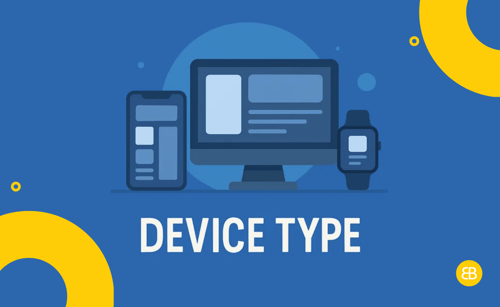
Device type refers to the kind of hardware your users use to access your app—like smartphones, tablets, desktops, or smartwatches. Knowing your users’ device types helps you optimise design, features, and performance for the best possible experience.
Why It Matters
- Cross-Device Compatibility: Ensures your app works and looks great on all screen sizes
- Responsive UX Design: Enhances usability by adapting layouts to each device
- Feature Tailoring: Enables device-specific functions based on hardware capabilities (e.g., GPS, camera)
- Smarter Analytics: Helps identify where users are most engaged and what devices they prefer
Use This Term When...
-
Designing app layouts and UI components
-
Testing functionality across mobile, tablet, and desktop platforms
-
Reviewing usage analytics by device type
-
Building adaptive or conditional features for mobile vs. desktop
-
Planning a mobile-first or cross-platform app development approach
Real-World Example
In the City Connect project, we built responsive layouts tailored to phones, tablets, and desktops. Our team tested interactions across devices to ensure a consistent and intuitive experience no matter where users accessed the app from.
Founder Insight
Many founders assume everyone uses the same device. In reality, usage varies greatly. Design for what your users actually use, not what you assume they do—especially if your app needs to perform across Android, iOS, and web.
Key Metrics / Concepts
-
Device Breakdown: % of users by device type (iOS, Android, desktop)
-
Screen Resolution: Helps design UI elements that scale correctly
-
Device Capabilities: Sensors, GPS, camera—tools that influence how your app functions
Tools & Technologies
-
Google Analytics: Breaks down app usage by device type
-
BrowserStack: Tests apps across real devices and screen sizes
-
Firebase: Offers device-specific crash logs and performance data
What’s Next / Future Trends
As foldable phones, wearables, and smart TVs become more mainstream, apps will need to respond dynamically to screen changes and device inputs. Expect adaptive UIs that shift in real time based on device capabilities and layout needs.
Related Terms
-
Responsive Design – Auto-adjusts UI to screen size
-
Cross-Platform App – Runs on multiple operating systems and devices
-
Mobile-First Design – Prioritises mobile usability, then scales up
-
UI (User Interface) – The app’s visual and interactive components
-
Multi-Device Optimisation – Enhancing performance across device types
Helpful Videos / Articles / Pages
- Blog: Here Are Some Web Techniques to Help Your Site Work Across Devices – and Be Seen Anywhere
- Blog: Android vs. iOS Users: How It Affects Your App Development
Call to Action
Not sure which devices your users rely on most?
Book a strategy session with our team to uncover key insights and optimise your app across all devices and screen sizes.