WEBSITE DEVELOPMENT / GRAZIA

Transforming Grazia: How We Enhanced User Engagement and Speed

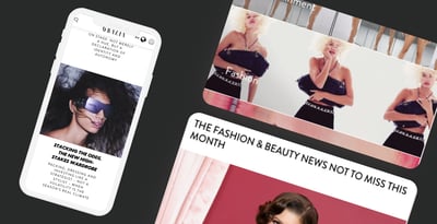
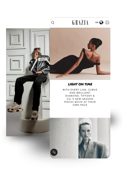
Grazia rebuilt for how fashion readers actually browse now — mobile-first, scroll-driven, and fast enough to keep them moving between stories.

Meet Grazia

Grazia is a global fashion media brand with audiences across the USA, Mexico, Spain, and Australia. It publishes high-volume fashion content across trends, runway coverage, editorials, and cultural commentary.

Its audience is fast-moving and highly visual. Most users engage through mobile, expecting immediate access to stories, images, and fashion updates without delay.

As content volume grew, the digital experience began to feel slower and less aligned with how users consumed fashion content.

When Content Outgrew the Platform

The website still reflected the brand visually, but performance and interaction patterns were starting to break down.

message-question-stroke-rounded

Slow Content Loading

Pages took longer to load due to heavy visual content, creating early drop-offs in browsing sessions.

icons8-user-groups-1-1-1

Low Content Interaction

Users were consuming articles but not moving deeper into galleries or related content.

icons-open-source

Mobile Friction

Most traffic came from mobile, but navigation felt designed for desktop-first reading behaviour.

icons-trello

Static Content Experience

Fashion content was visually strong but not interactive, limiting engagement beyond initial clicks.

We were getting traffic, but not sustained engagement.

Over time, Grazia risked losing repeat visits as users moved toward faster, more interactive fashion platforms.

Expectations Had Shifted

Grazia's team had doubts before committing to EB Pearls. They weren't sure if the platform would meet their reader's need without compromising usability.

  • I wasn’t sure if we needed a full rebuild or just performance fixes.

  • We didn’t want to lose the visual identity we had built over time.

  • Would improving speed change how users experience our content?

The goal wasn’t to change Grazia’s identity — it was to align performance with how users already behaved.

90-1

Rethinking the problem

Most users weren't leaving because of content quality — they were leaving because of delay, friction, and unclear paths through the site. So we stopped redesigning content and started restructuring how people moved through it.

★   the reframe   •   built to last™ The right architecture
The issue wasn't aesthetics — it was broken flows and slow performance.
Grazia's visual identity was strong. What users were struggling with was how the content moved, loaded, and connected.

Solutions that spark joy

EB Pearls delivered a full redesign, content migration, and interactive features using WordPress VIP, PHP, MySQL, and Sass.

icons8-laptop-and-phone-1-1

Performance Optimisation

Improved load speed across high-traffic editorial and visual pages to reduce early session drop-offs.
icons-open-source

Mobile-First Navigation

Rebuilt navigation patterns to support scroll-based discovery across articles and fashion categories.
icons8-natural-user-interface-2-1

Interactive Content Modules

Introduced dynamic galleries and visual storytelling components to increase engagement depth.
icons8-knowledge-sharing

Content Structure Refinement

Reorganised editorial layouts to improve readability and reduce cognitive load during browsing.
icons8-service-50-1

Scalable CMS Architecture

Implemented a structured backend using WordPress VIP for high-volume publishing and stability.
mobile app solutions icon-1

Visual Content Delivery System

Optimised image-heavy fashion content for faster rendering without reducing quality.

Balancing Speed With Visual Identity

01 Managing heavy visual content at scalen — Fashion content is image-heavy. The challenge was improving speed without reducing visual quality.

02 Preserving brand identity during migration — The redesign needed to modernise the experience while keeping Grazia’s editorial style intact.

03 Aligning desktop legacy with mobile behaviour — The original system was built for desktop browsing, while most users were now mobile-first.

04 Preventing disruption during rollout — Large-scale content migration had to happen without affecting live publishing cycles.

Three shifts the rebuild delivered

EB Pearls demonstrated reliability and partnership at every step. Here's what changed for Grazia's readers.

From Browsing to Engagement

Once the new experience went live, Grazia shifted from passive readership to active exploration.
Metric Before After  ·  EB Pearls
Engagement Depth Single-article sessions
+42% deeper multi-page sessions
Mobile Load Performance Slow image-heavy pages
38% faster
Session Duration Industry baseline
+31% increase

Browsing stopped being linear. It became exploration.

Users stopped treating Grazia as a static reading site. They began moving through content pathways — from articles to galleries to related fashion features in a single session.

Editorial teams also gained a more flexible publishing structure, allowing content to be presented in more dynamic ways without redesigning layouts each time.

89

Your manual process isn't the problem.
Your system is.

See how better content systems create deeper engagement across digital platforms.

Hey! Got a project?

Your project's type

What are the next steps?

  1. Our sales team reaches you within a few hours to organise a FREE consultation.
  2. Meanwhile, we sign an NDA to ensure the highest privacy level and protection of your idea.
  3. We will conduct a FREE consultation to understand your business requirements and will answer any questions you may have.
  4. Our expert strategist presents project estimates and approximate timelines.