Table of Contents
Your website's design is important not just for aesthetics. It can also help improve your SEO ranking and website traffic, reduce bounce rate, convert leads and increase sales and return visits.
If you had put up a website a long time ago, you might be due for a refresh or redesign. However, redesigning a website can be intimidating, costly and time-consuming. This article will help you know when it’s time to redesign your website and how it can actually be a wise investment.
Why You Should Redesign Your Website?
Your website is the face of your company online, so it's important to ensure it always reflects your company's core values professionally. That doesn't mean you should change your brand's style guide, but you should be open to adapting new visual elements.
By looking at other updated websites, you can compare yours to see what needs to be improved, added, changed, or deleted.
Here are four things that indicate it's time to redesign your website:
Low SEO Ranking
When you search for something online, and your site doesn't show up within the first few pages of the search engine result page, this means that your website ranks low in search engine optimization.
Using appropriate keywords in your site's title and throughout your site's content will help search engines identify and categorise your site. Linking to popular external sources that relate to your target audience will also help you be found.
Website That’s Hard to Navigate
If you notice that visitors frequently visit your site but leave shortly after being on it, this could mean that your site is poorly designed. Poorly designed websites are not only aesthetically unpleasing but also tricky to navigate.
This includes either lack of or needs improvement of the calls to action, visual design elements, ease in navigation, the proper order of elements and other issues. Addressing these issues is crucial to keeping users engaged.
Website Taking Too Long to Load
The bounce rate is the percentage of visitors who come to your website and leave immediately without doing anything like clicking a CTA button. A reasonable bounce rate is from 26– 40 per cent. Anything higher means that there is something wrong.
According to polls, 40 per cent of users will close a website if it takes longer than 3 seconds to load. Additionally, 47% of users expect websites to load in 2 seconds. This can lead to a high bounce rate. (Source)
Not Mobile Optimized Website
In the US, one in four users access the web from a mobile device. Consumers using their smartphones and other mobile devices to make purchasing decisions is increasing, and this trend is likely to continue.
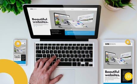
When designing a website, ensure it works well on desktop computers and mobile devices. Optimize your images for a smaller phone screen and keep load times in mind. Also, data size and response time can be very different on the phone than on a computer, so consider that as well.
Conclusion
You only have two to three seconds to impress and convince a customer to stay on your website. An outdated website will quickly turn potential customers away, which is the opposite of what you want. A good user experience should be your top priority when redesigning your website.
Do you need a professional web design that's both desktop and mobile-optimised? EB Pearls is the best web design company in Australia that also offers mobile apps, eCommerce services and more! Book your free consultation!

Michael leads the UX/UI team at EB Pearls, bringing 30+ years of experience in interaction design and crafting digital products for Fortune 50 companies.
Read more Articles by this Author
