
04 Apr 2018
ContentBinisha Sharma
A good website should be clear in the information that it provides, easy to navigate regardless of the device you’re using, and it needs to be visually pleasing. No one likes seeing big walls of text on websites, nor do they like cluttered sites that are too distracting.
Here you’ll find some of the best examples of websites in Australia, as well as a guide to what makes them so compelling.
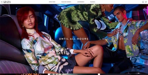
Grazia
The experience of flipping through a glossy, high-quality fashion magazine is one of the most difficult experiences to recreate on the web. High resolution photos don’t load quickly, and with so many different screen sizes and resolutions to work with dynamically, it can be hard to make the screen look “glossy” and deluxe. However, Grazia has achieved all of this, with each page and link on the site looking gorgeous, and filled with high quality images and fashion that load quickly and efficiently.
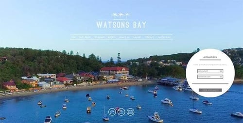
Watsons Bay Hotel
This is one of the best examples of dynamic design that you’ll see on a website. Regardless of what screen size and resolution you look at the Watsons Bay Hotel website, you’ll find all the essential information immediately at your fingertips. The website minimises the number of clicks that you need to make to get to bookings, while also providing users with plenty of editorial information on what’s going on in the area and at the hotel, making this a website that customers will want to spend a lot of time on.
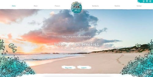
Raw Organic Kombucha
Thanks to its clean and efficient design, this website allows you to find out everything that you need to know about kombucha with a minimum of fuss. Perhaps the greatest strength of the website is the links off the main page, with the website’s pages being very logical, and focused on sharing only the critical information that customers need to know. The Instagram feed displayed on the bottom of the page is an excellent way of injecting a sense of community and culture into the product.
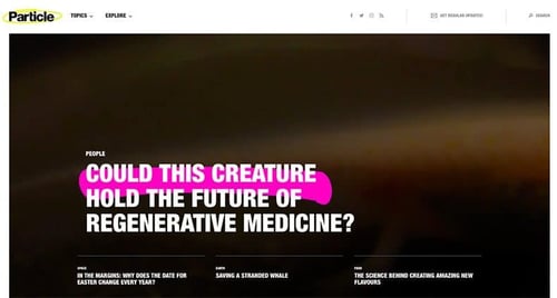
Particle
This website makes it easy to find information of interest in an instant. The top of the page is dominated by just two link menus: “Topics” and “Explore”, and those lead to nine different categories that are titled simply but informatively: “Food”, “Space”, “Watch” and so on.
The descriptive minimalism of this approach means that for an information-heavy website such as Particle, users are able to quickly navigate to what is of interest to them, meaning that it never feels cluttered or clunky to use.
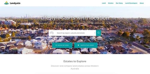
Landguide
The primary reason people come to Landguide is to search for information on the price of land in an area that they’re interested in. So, no matter what device you’re looking at Landguide on, the very first thing you’ll see when loading up the page is a search bar that allows you to input a postcode or region name, and start narrowing down the cost of land in that area.
Underneath that bar there’s plenty of additional supplementary information, but in focusing the website experience on the main purpose of the website, Landguide represents the ideal approach to website design.
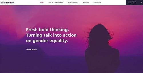
Balance Now
For Balance Now, an organisation that seeks to promote gender equality in the workplace, being inspirational is an important theme to the website. The goal of the business needs to be to motivate other organisations to see the value of gender equality, which is why the site doesn’t look anything like a dry business site.
It makes clever use of inspirational imagery and strong, motivational language to really drive home the ideology and message, rather than appear as a standard “informative” business website.
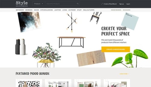
Style Sourcebook
As an online marketplace, Style Sourcebook has a lot of information to share. Across dozens of sub-pages, the website could easily be cluttered with product information and become difficult to navigate.
The secret to the website’s success is that it makes heavy use of white space in order to focus the user’s attention on the visual information that’s important. All products are pictured with a white background, and the website itself is almost entirely white space around those products. The result is an airy, minimalist website design that is far easier to flip through than you might initially expect.
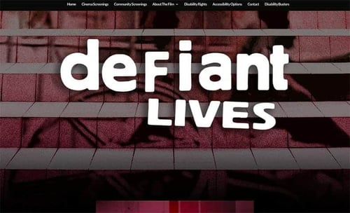
Defiant Lives
Defiant Lives is a documentary movie about a great cause – the fight that Australia’s disabled people have had for gaining greater autonomy in society. On the home page is the trailer for the movie - once watching that (and hopefully feeling encouraged to find out more) you are then likely to notice the site’s screening information, the film’s credits and contact details, and so on.
In other words, this website leads with its most compelling content - footage of the documentary itself - and then provides users with all the information they need around that “core” content to “buy into” the product.
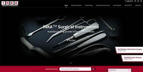
Inka Surgical
As surgical instruments are an incredibly niche product, the website designers behind Inka Surgical are likely right in assuming that anyone coming to the website already has a solid idea of what they’re looking for. Thus the “quick product search” bar at the top of the site helps minimise a busy professional’s time on the site. They’ll be able to find what they’re looking for almost instantly, and then immediately from the product page request a quote for the tool that they’re looking to acquire.
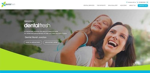
Dental Fresh
A clean menu system at the Dental Fresh website makes it easy to navigate to the right information you’re looking for. With informative titles and headlines to keep you clicking through to what you’re looking for, and the website itself is written an a clear, easy to understand fashion, which is important for anything to do with healthcare services – the last thing you want to do is confuse or frighten a customer.
The common thread that runs through all of these websites, and makes them the best examples of website designs, is that they’re efficient and “clean”. They’re easy to navigate, focus the user’s attention on the important information, and don’t waste the user’s time in getting to what they came to the website for in the first place.
EB Pearls are the experts at creating clean, efficient websites designed to suit your industry and your target audience. To get a quote for your next website design project, contact us now on 02 8880 7857.

Binisha leads customer management, fostering a talented design team. As a client advocate, she ensures needs are met, enhancing the overall experience.
Read more Articles by this Author